Adding the final final pages

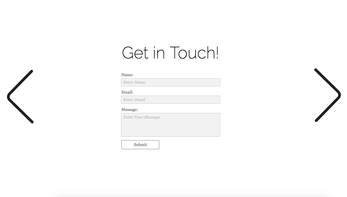
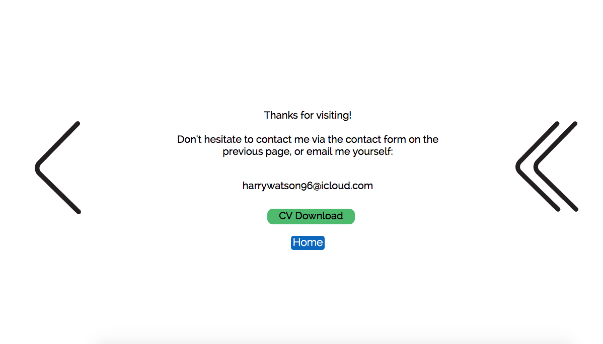
After completing the browser idea, I thought I was done before I realised I had left users with no actual way of contacting me. Using a muse contact form I set up a feedback page that pings straight to my email. As well as this I have a page with my email and a downloadable version of my CV. I kept the design of these pages clean and simple, not wanting to flood the page with information for the ease of the user. This very last page acts as the “skip” page. As on the home page there was a skip button for any returning users that won’t want to trawl through the entire site again.

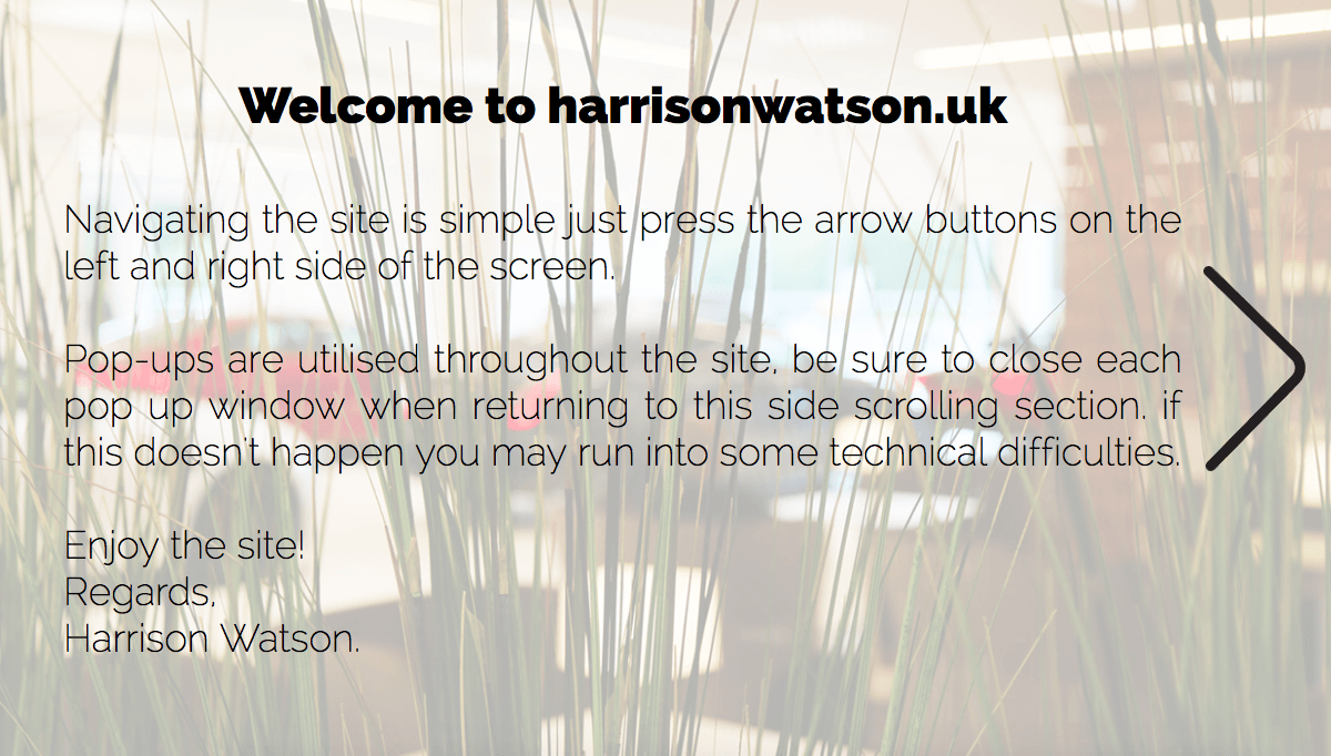
I have also added a few words on the first page of the side scroll simply telling users how to navigate the site, and letting them know about shutting down each pop up as they use it. This page acts as a sort of foreword for the site, the image also has a parallax effect which really helps make the transition to the wooden iPhone page a lot smoother.


Screen Shot 2017-04-26 at 21.20.40 Screen Shot 2017-04-26 at 21.20.50 Screen Shot 2017-04-26 at 21.21.17

Final Page

The third and final page of my site is going to be a web browser. On the previous pages I have covered everything I had set out to. Every aspect of my CV has been covered and fits nicely into different pages on the site. For my final page I’m simply going to have 4 logos for my different social media accounts. Facebook, Twitter, Linked in and YouTube. The design of the window will be the same as the Chrome Apps window.

Screen Shot 2017-04-26 at 16.23.35


The user will be have easy access to my social media accounts as this is such an important part of the media industry nowadays.

Following this page I will have a contact form that users can fill out and submit if they wish to get in touch.

Spotify/Music Page

When I was first planning out the site I knew that I wanted it to be mostly filled with the information from my CV. Whilst I am communicating my interests through things like The Football Manager idea I wanted to have a page separate from work entirely, I felt a good way to do this was simply by having a page with my favourite musicians and the sorts of music I listen too in different moods was an easy way to make my site a bit more personal without going over the top. I took inspiration of course from Spotify’s UI, the images below are of spotify’s page and mine.

spotify-moods-310315

Screen Shot 2017-04-26 at 20.30.12

Current Site Build

I have added another section to the current build of my site. Linking from the Movies app on the desktop dock it houses youtube links with thumbnails that open into a neat pop up filling the screen with the youtube video. The design is minimalistic and simple as it can be, taking some inspiration from apples “Front Row” a movie trailer viewing app that was discontinued in 2011. – https://en.wikipedia.org/wiki/Front_Row_(software)


Again, rather than uploading the site to business catalyst I recorded myself running through the site atm. There were some errors that I found whilst making the site which have since been rectified. Key changes are, the “camera” icon is now a link to my instagram, and the entire movies page is functional with (nearly) all my work on the site.

Site Length

I have been thinking a lot recently about how long my site needs to be. After doing some research I found that typically users spend very little amount of time on websites before losing interest and leaving the site. To combat the potentially boring intro “resize” window at the start of my site I have added a short loading screen that shows if the user has resized their window and once they have the loading bar disappears. This loading animation remains for 20 seconds, as I assume everyone will have managed to resize their browser by then. With regard to the length of my actual site I am planning to have a total of around 13 pages. With around 3 main pages (on the interactive narrative page) acting as home pages with links to the sub-pages.